
Mobile SEO is the process of optimizing your website to improve its appearance and search rankings on mobile devices.
Mobile optimization is essential because billions of people use their mobile devices to search the web.
Did you know that the number of smartphone users worldwide reached almost 6.7 billion and is expected to exceed 7.7 billion by 2028?

And Google ranks your site based on the mobile experience first, NOT desktop.
So if your site isn’t built for mobile users, you’re losing traffic, rankings, and readers every single day.
The good news?
You don’t need to be a tech expert to fix this. In this guide, we’ll walk you through 8 simple mobile SEO best practices that anyone can follow, even if you’re just starting out.
Let’s get into it.
Top 8 Mobile SEO Best Practices to Improve Your Rankings for 2026

1. Create a Mobile-Friendly Site
60% of all internet traffic comes from mobile devices.
Yet most websites are still built with desktop users in mind.
That’s a HUGE mistake.
Did you know that Google uses mobile-first indexing?
Mobile-first indexing is enabled by default for all new websites.
Mobile-first indexing means Google primarily uses the mobile version of a webpage for crawling and indexing, rather than the desktop version.
If your site is hard to read or navigate on a smartphone, visitors bounce. And Google notices that and punishes you with poor search rankings.
So what does a mobile-friendly site actually look like?
- Text you can read without zooming in
- Buttons big enough to tap with a thumb
- Pages that load in under 3 seconds
- A layout that fits any screen size automatically
Most themes on WordPress, Wix, or Squarespace are already responsive. Just make sure you pick one that works great on a phone, tablet, or desktop.
Quick tip: Regularly test your site on both iOS and Android devices to identify layout, speed, and usability issues that can hurt your mobile search rankings.
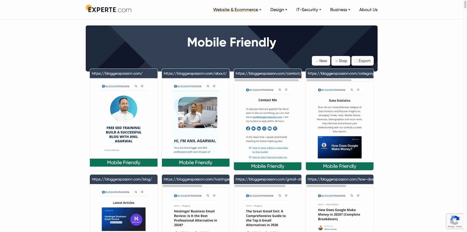
You can also use free tools like Experte to quickly check how your site looks and performs on mobile devices.
2. Optimize Images & Videos for Mobile
Here’s something most bloggers ignore.
A single unoptimized image can slow your page load time by several seconds.
On mobile, that’s enough to lose a visitor forever. In fact, 53% of mobile users abandon a site if it takes more than 3 seconds to load.
So how do you fix this?
For Images:
- Convert images to WebP format. This is the latest image format, smaller than JPEG or PNG but just as sharp.
- Compress images before uploading using free tools like Squoosh or TinyPNG
- Use lazy loading to load images only when the user scrolls to them, not all at once. Try plugins like WP Rocket to enable this feature.
For Videos:
- Don’t self-host videos on your website. Try uploading to YouTube or Vimeo and embedding them instead to keep your pages lightweight and improve loading speed on mobile devices.
- Avoid autoplay videos, as they eat mobile data and annoy users
- Add captions, as most people watch videos on mobile with the sound off
3. Avoid Intrusive Popups
No one likes a pop-up appearing the moment they open a page.
On a desktop, it’s annoying. On mobile, it’s even worse.
And Google agrees.
Google lowers rankings for sites with annoying mobile pop-ups. If a pop-up covers the whole screen and is difficult to close, it can hurt your rankings.

But here’s the thing.
Popups aren’t all bad. It’s the intrusive ones that hurt you.
Popups that get you penalized:
- Full-screen popups that appear right when someone lands on your page
- Popups that are hard to close with tiny X buttons
- Popups that cover the main content before the user even reads anything
Popups that are totally fine:
- Small banners at the top or bottom of the screen, where you can use a simple offer or CTA
- Popups that only appear when a user is about to leave
- Age verification or cookie consent popups, as Google gives these a pass
Tip: If you need to use a pop-up, trigger it after user engagement, like 30 to 60 seconds on the page, 50% scroll, or a button click. Avoid showing it immediately on page load.
4. Optimize Titles & Meta Descriptions for Mobile
Here’s something most bloggers never think about.
Your title and meta description are the first things people see before clicking on your site.
Write boring titles, and nobody clicks. No clicks means no traffic. No traffic means no rankings.
Simple as that.
But here’s the mobile-specific problem.
Mobile screens are smaller. So Google cuts off longer titles and descriptions much faster than on desktop.
For titles:
- Keep them under 60 characters
- Put your main keyword near the front
- Make it clear what the page is about in one line
For meta descriptions:
- Keep them under 120 characters for mobile (150 for desktop)
- Match the search intent
- Add a natural call to action such as “Learn how”, “Find out”, “See why”

Tip: Use a free tool like Yoast SEO or Rank Math to preview exactly how your title and description look on mobile before you hit publish.
5. Optimize for Local Mobile SEO
An interesting stat: 76% of people who search for something nearby on their phone visit a business within 24 hours.
Think about that.
Someone searches “best coffee shop near me” on their phone. Google shows three results. They pick one and visit that shop all within the same day.
That’s the power of local mobile SEO.
If you operate a local business or small business, you must optimize for mobile.
So, what’s the best way to leverage local mobile SEO to generate more traffic and sales?
Target geo-specific keywords
You must use local keywords in your website content. You should find and use geo-specific keywords, which are keywords that focus on location.
Here are some examples of geo-specific keywords:
- “Pizza delivery near me”
- “Plumber in San Francisco”
- “Hair salon in Los Angeles”
- “Car dealership in New York”
- “Coffee shop in Seattle”
You can use a keyword research tool like Semrush to find geo-specific keywords.
Have a look at an example keyword;

Set up Google Business Profile
- It’s free and takes less than 30 minutes
- Add your business name, address, phone number, and hours
- Upload real photos, as listings with photos get 42% more clicks
Use local keywords naturally
- Instead of “best pizza,” try “best pizza in Austin”
- Add your city or neighborhood name to your page titles and headings
- Create a dedicated contact page with your full address
Get more reviews
- Ask your customers to leave a Google review
- More reviews = more trust = higher local rankings
- Respond to every review, whether it’s good or bad
Above all, make sure your NAP is consistent
NAP stands for Name, Address, Phone number. Make sure these details match exactly across your website, Google Business Profile, and every other directory you’re listed on.
6. Optimize “Above the Fold”
First, what does “above the fold” even mean?
It’s everything a visitor sees on their screen before they start scrolling.
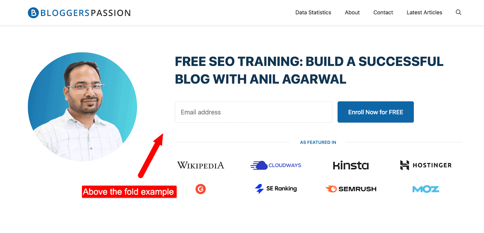
Above the fold on smartphones is extremely important because it is the first thing that visitors see when they land on your page.
On mobile, that space is tiny. So, you need to make it count.
Here’s what it looks like on mobile;
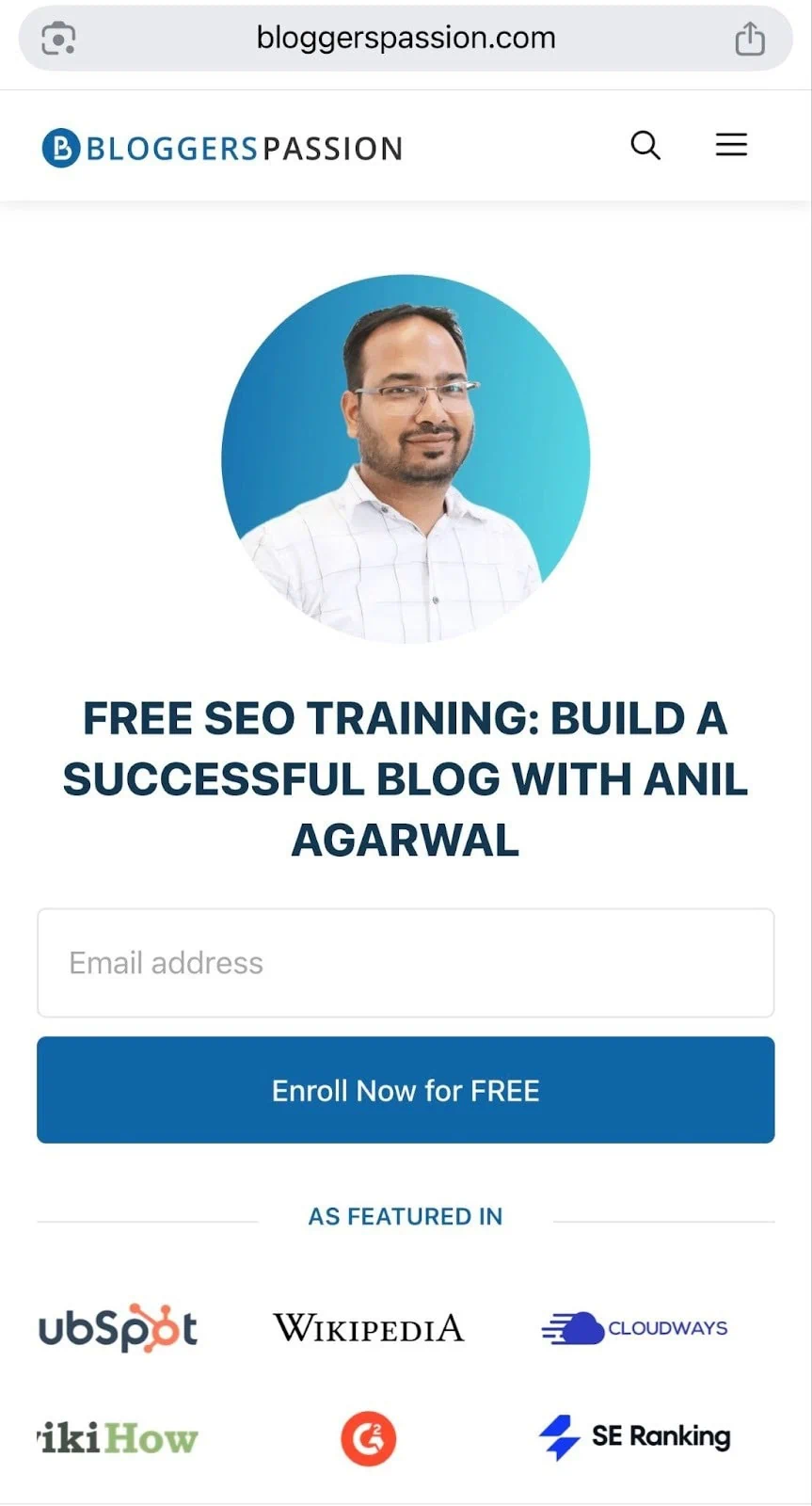
Here’s what the above-the-fold should have:
- Use a clear headline. Tell visitors exactly what the page is about in one line
- A fast-loading image. Use one relevant image, not five
- No big banners or annoying ads
- Readable text with at least 16px font size, no tiny paragraphs
A simple test: pull out your phone right now and open your own website.
What’s the first thing you see? Is it helpful? Is it clear? Would you keep scrolling?
If the answer is no, you need to fix that fast.
7. Research Keywords for Voice Search
Here’s how most people search on mobile.
They don’t type “best running shoes 2026.”
They talk to their phone and say, “Hey Google, what are the best running shoes for beginners?”
That’s voice search. And it’s bigger than most bloggers realize.
According to voice search statistics, over 40% of adults use voice search every day. 65% of people use voice search while driving. And that number keeps growing.

The difference between voice and text search? The way people talk.
Voice searches are longer, more conversational, and usually phrased as questions.
So your keyword strategy needs to match that.
Some examples of voice search:
- “Find me the nearest coffee shop.”
- “What is the weather forecast for tomorrow?”
- “How do I fix a slow laptop step by step?'”
- “Set a timer for 10 minutes.”
How to find voice search keywords?
- Think in questions such as who, what, where, when, why, and how
- Use AnswerThePublic and type in your topic, and it shows hundreds of real questions people ask
- Check Google’s People Also Ask box, as they contain real-time voice-style queries
- Look at featured snippets, as voice search results almost always come from these
How to optimize for them?
- Add an FAQ section at the bottom of your posts
- Answer questions in short sentences with 2 to 3 lines max
- Use conversational language as you need to write how people actually talk
- Target long-tail keywords, which are phrases with 5+ words, convert better for voice
One more thing worth knowing.
Voice search optimization now also helps you show up in AI search tools like ChatGPT and Google’s AI Overviews.
So optimizing for voice search today is really optimizing for the future of search.
8. Improve Core Web Vitals
Core Web Vitals (CWV) are speed metrics that Google uses to understand how users experience a web page. It simply measures the speed, responsiveness, and visual stability of websites.
The higher your website’s CWV scores, the better your search performance.
Semrush is one of the best tools for identifying your website’s CWV scores.
You can use Semrush’s Site Audit tool to find core web vital scores.
Here’s what it looks like;
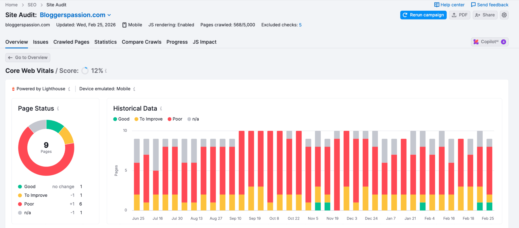
The best part? The tool also gives you suggestions when you scroll down a bit.
Have a look;
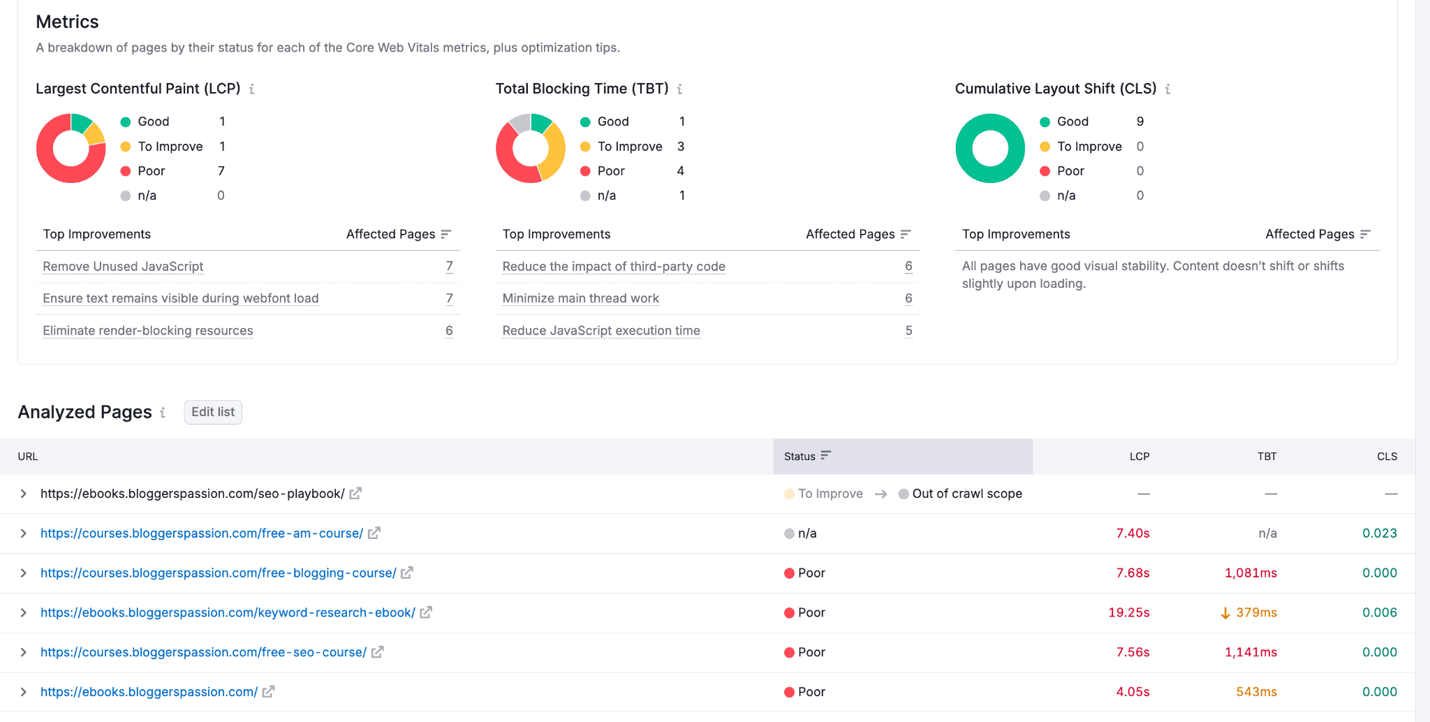
See that? You’ll get a breakdown of pages by their status for each Core Web Vitals metric, plus optimization tips.
Here are a few quick tips for improving CWV scores;
- Optimize the LCP element. Try to reduce the size of your background images (or images usually). Consider using a WebP image format and preloading it.
- Optimize CSS + JavaScript, etc. You can use CSS Minifier, a free, simple tool that automatically compresses CSS assets.
- Optimize third-party code by hosting your website fonts, analytics, etc., locally
- Make sure to use the WebP format while using images. It’s a modern image format that provides excellent lossless image compression.
Mobile SEO Checklist: Don’t Miss These Fixes
Here is a quick 15-point mobile SEO checklist for SEOs and website owners.
- Using a responsive theme
- Text is readable without zooming
- Pages load in under 3 seconds
- Images converted to WebP format
- Images compressed with Squoosh or TinyPNG
- Videos hosted on YouTube or Vimeo
- No full-screen popups on mobile
- Title under 60 characters
- Meta description under 120 characters
- Google Business Profile set up
- NAP is consistent across all platforms
- Clear headline visible above the fold
- Font size at least 16px
- Add an FAQ section to posts
- Targeting question-based keywords
FAQs on mobile SEO strategy
Here are some frequently asked questions about mobile search engine optimization.
You can use a free tool like BrowserStack to test your website on various devices, including smartphones. If your site is not mobile-responsive, you can use a mobile-friendly theme.
Mobile SEO is the process of optimizing your website for people using smartphones and tablets to browse the web.
According to Google, half of searches come from mobile devices. If your website or business is NOT optimized for mobile, you’ll lose all the traffic, leads, and sales. Mobile optimization helps you with better sales and traffic.
Make your site fast, responsive, and easy to use on mobile, with readable content and optimized images. Avoid intrusive pop-ups.
Mobile SEO PRIMARILY focuses on optimizing your website for mobile devices, such as smartphones and tablets, whereas desktop SEO focuses on desktop computers and laptops.
Related Posts:
- Bing SEO 2026: A Simple Yet Practical Guide for Beginners
- 12 Proven YouTube SEO Tips to Get Your Videos Noticed
Final thoughts on SEO for mobile devices
Most bloggers still ignore mobile SEO completely. Which means just by following the 8 steps in this guide, you’re already ahead of the majority.
Start small if you need to.
Check your Core Web Vitals. Test your site on your phone. Fix your images. Update your titles. One step at a time.
What are your thoughts on SEO for mobile devices? Do you have a mobile SEO strategy? Have any questions? Let us know in the comments.


Fantastic Guide! This blog post is incredibly insightful and packed with practical tips for optimizing websites for smartphone users. In today's mobile-first world, ensuring a seamless mobile experience is crucial, and your detailed guide makes it so much easier to understand and implement. Thank you for sharing such a comprehensive and easy-to-follow resource. This is definitely a must-read for anyone looking to enhance their mobile SEO strategy. Keep up the great work!